May 1, 2022
How we rebranded Memo to reflect the future of narrative + data
Allison Horton
In the three years since Memo was founded, we’ve seen incredible traction: Fortune 10 brands adopting readership, premier publications coming on board, and category-defining investors joining in on our vision.
But our visual identity didn’t reflect this progress or the impact we still hoped to make. So we underwent a visual rebrand to better communicate Memo’s unique and growing role in the PR & Comms space.
We started with the qualities Memo’s brand had to convey
We believe in the power of narrative to define our world, and the necessity of data to evaluate it.
As a company bringing entirely new data to the PR industry, Memo needed a modern visual identity that would speak to the modern Communicator, and a look and feel that was completely differentiated from the legacy solutions those customers were looking to move away from.
But the other side of Memo’s business – the publications we partner with for readership data – was rooted in a time-honored tradition that we also wanted to pay homage to.
The resulting visual identity therefore needed to be bold but reliable, and blend modernity with heritage.
We selected colors that emphasized Memo’s unique offering in the PR industry
Our color scheme had to achieve two goals: 1) reflect our brand values, and 2) set Memo apart from legacy PR measurement platforms.
Communicating both a trust for and the novelty of Memo’s data were key, so our primary colors are a dark blue – to signal that our platform is reliable, serious, and bold – and a bright turquoise, a freshness to establish Memo as different from the rest.

Secondary colors include a bright yellow, whose warmth introduces an approachability we aim to cultivate in how we present our data and work with customers, and a periwinkle purple, which transmits wisdom and intelligence.
Typography choices represent a modern solution grounded in a reverence for tradition
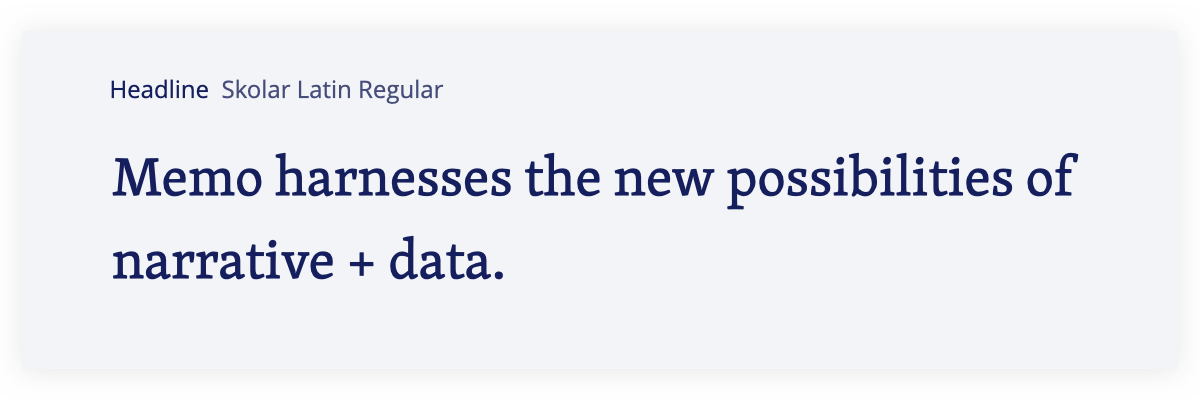
We wanted Memo’s primary typeface to be a serif, both to signal the dependability and sophistication of our data, and as an homage to the tradition of news publishing from which that data stems. We ultimately chose Skolar because it carries the connotations of a serif font while also including unique elements, like strokes that were less angular and more approachable.

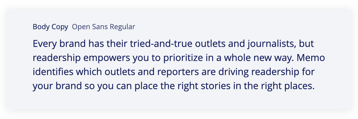
To balance this with an element of modernity, we chose a sans serif for the secondary typeface, specifically Open Sans for its legibility and friendly appearance.

Introducing the accessibility of Open Sans to the traditionalism of Skolar mirrored Memo’s own mission to bring new clarity and insight to the practice of public relations.
We designed a logo to echo how Memo is introducing a new era for PR measurement
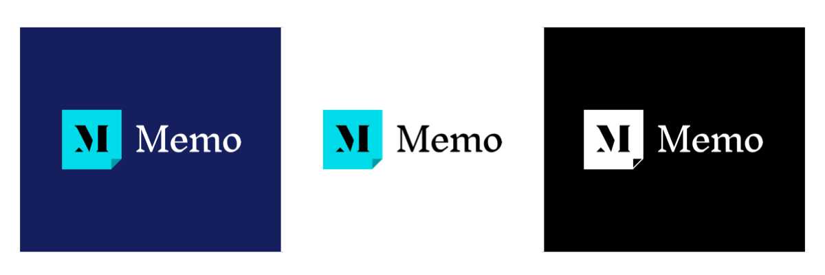
We paired a wordmark in Inknut Antiqua – a serif again as a nod to publishers but with a modern take – with an icon that tells Memo’s story.

The “M” of the icon is constructed out of geometric shapes, representing a narrative that gets constructed from new pieces of information.
The container of the icon mimics a dog-eared page as a metaphor for marking important information. The lower right placement further signifies the turning of a page, much as Memo is moving PR measurement and strategy into the future. The bright blue further reinforces this fresh perspective.
Graphical elements are derived from Memo’s logo for a distinct look and feel
Geometric patterns derived from the logo icon’s square container and triangular corner get repeated in Memo’s brand colors, creating simple patterns throughout the website.

These patterns are incorporated into imagery that alludes to our product benefits without being overly literal, allowing the corresponding text to tell the story. Images are styled with corner cuts that also mimic the logo icon, reinforcing how Memo lifts the curtain with readership data.

This branding exercise, in addition to curating a distinct look and feed for Memo, helped us crystallize the values we care most about as a brand: creating a future that unlocks the tremendous value both publications and the PR industry deliver.